

| Project Summary | |
| Role | Editor-in-Chief, Founder, Designer |
| Project | High School Newspaper |
| Technologies | InDesign, Illustrator, Photoshop, Filemaker, Pages, Keynote |
I always felt a school should always have a newspaper, and since my school paper fell apart decades before my time, I thought I'd resurrect it and rebrand it in a new way. My goal wasn't just to have any school paper, but to have one of the best designs and content. Paper may seem a bit out of date, but I believe there is still so much that can be done in that medium to make reading an awesome experience.
![]() Download A Sample Issue
Download A Sample Issue
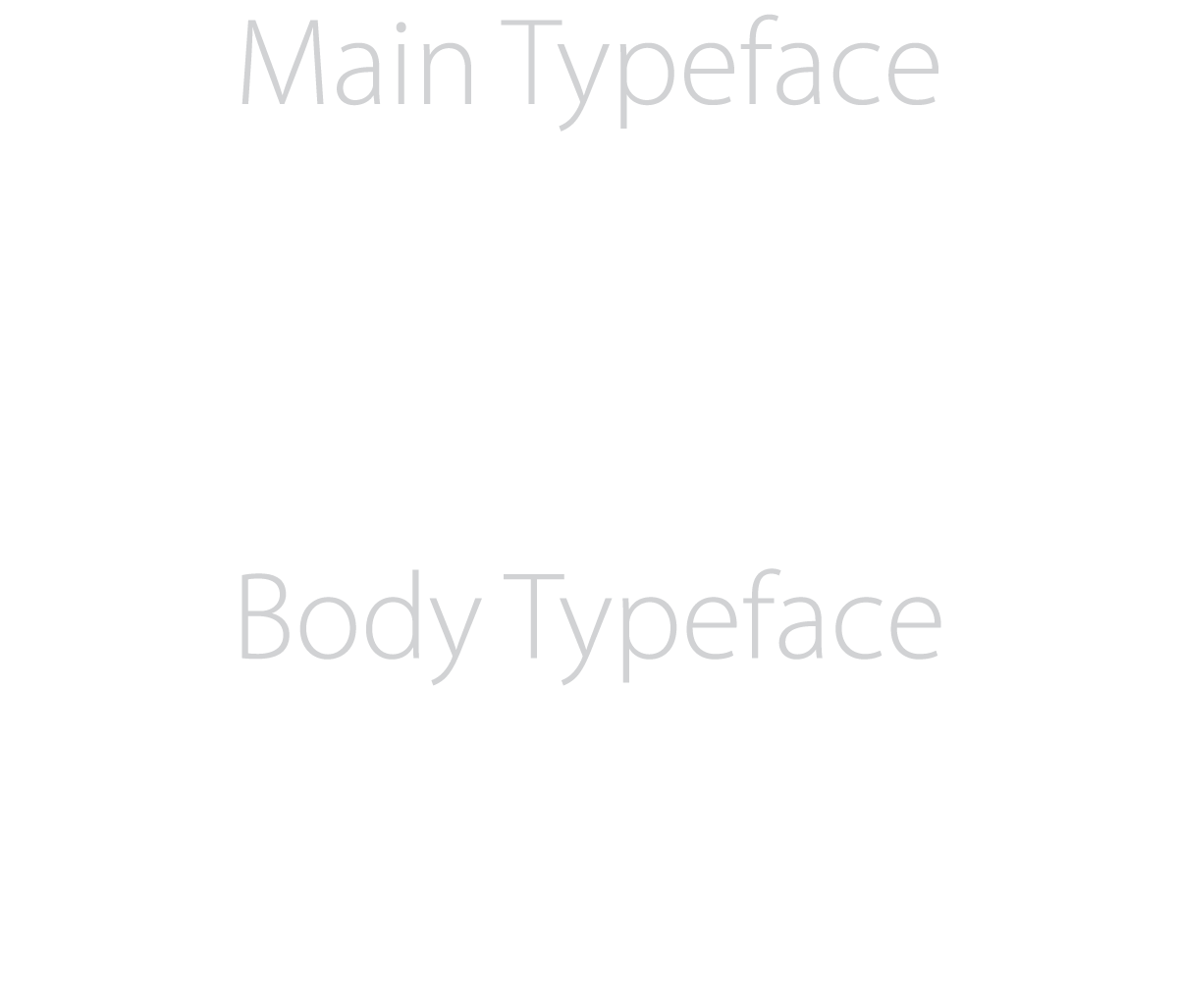
Enormous amounts of time were spent on selecting the typeface. Typefaces are essential to making a reader want to read an article, and they are vital to establishing a brand. Myriad Pro was chosen as the primary font for its elegance and modernism while Minion Pro was chosen for the body text as it was sleek and easy on the eyes for long reading.

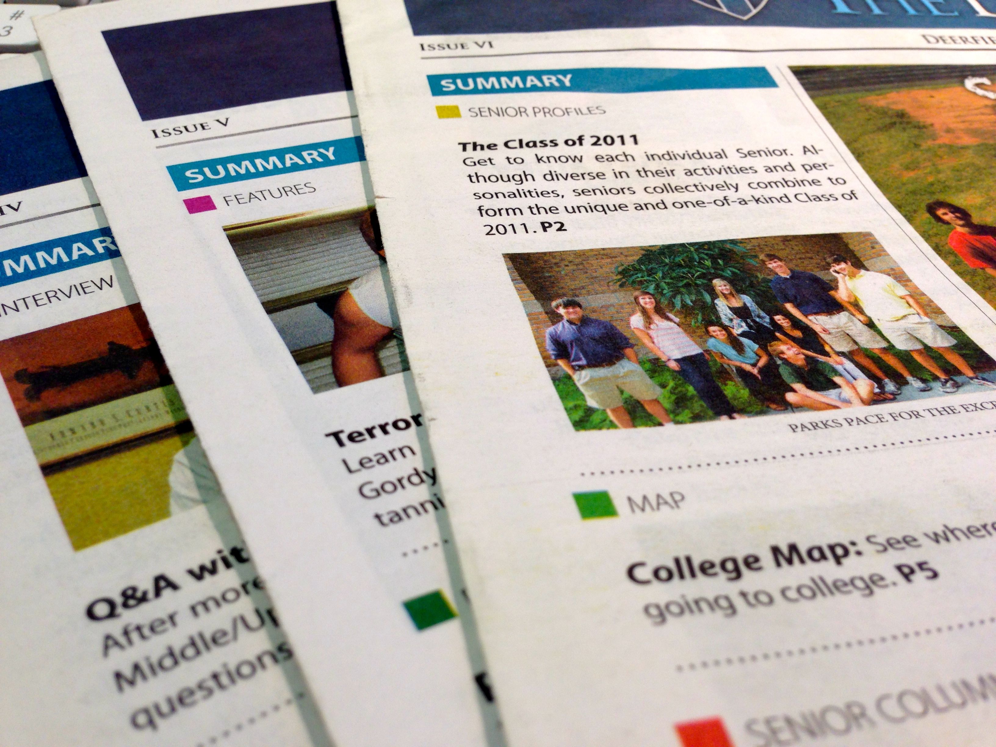
Every article is clearly indicated with a 4pt thick bar over the title. For a reader, it can be easy to get lost in the myriad of articles on each page, so this bar serves as an anchor for always letting the reader know where they are — this is an inspiration from a newspaper called El Economista, a newspaper located in Spain. Titles are usually in Myriad Pro Bold or Semibold, with the subtitle one thickness lighter. A thin line separates where the title area ends and where the actual article begins.
Drawing inspiration from USA Today, I felt associating color with a certain category of news would help build familiarity with the paper. However, I was careful not to rely too heavily on color association so that those with color blindness can still enjoy the paper to the fullest. In the end, fairly industry standard colors were chosen, such as red for sports and blue for standard news articles.

For print, how it looks is just the beginning. How it feels is just as important. I decided that an 11 by 17 inch tabloid would be the best size for a school paper. It's not as large as a full broadsheet (about 29 x 23 in), so it feels great to hold and flip through pages. The 35 lb Alternative Offset also makes the paper have a sturdy feel, compared to the more common and thinner 20 lb weight. Stochastic screening also makes text and colors pop, giving the paper a crisp look with almost no ghosting and smudging.

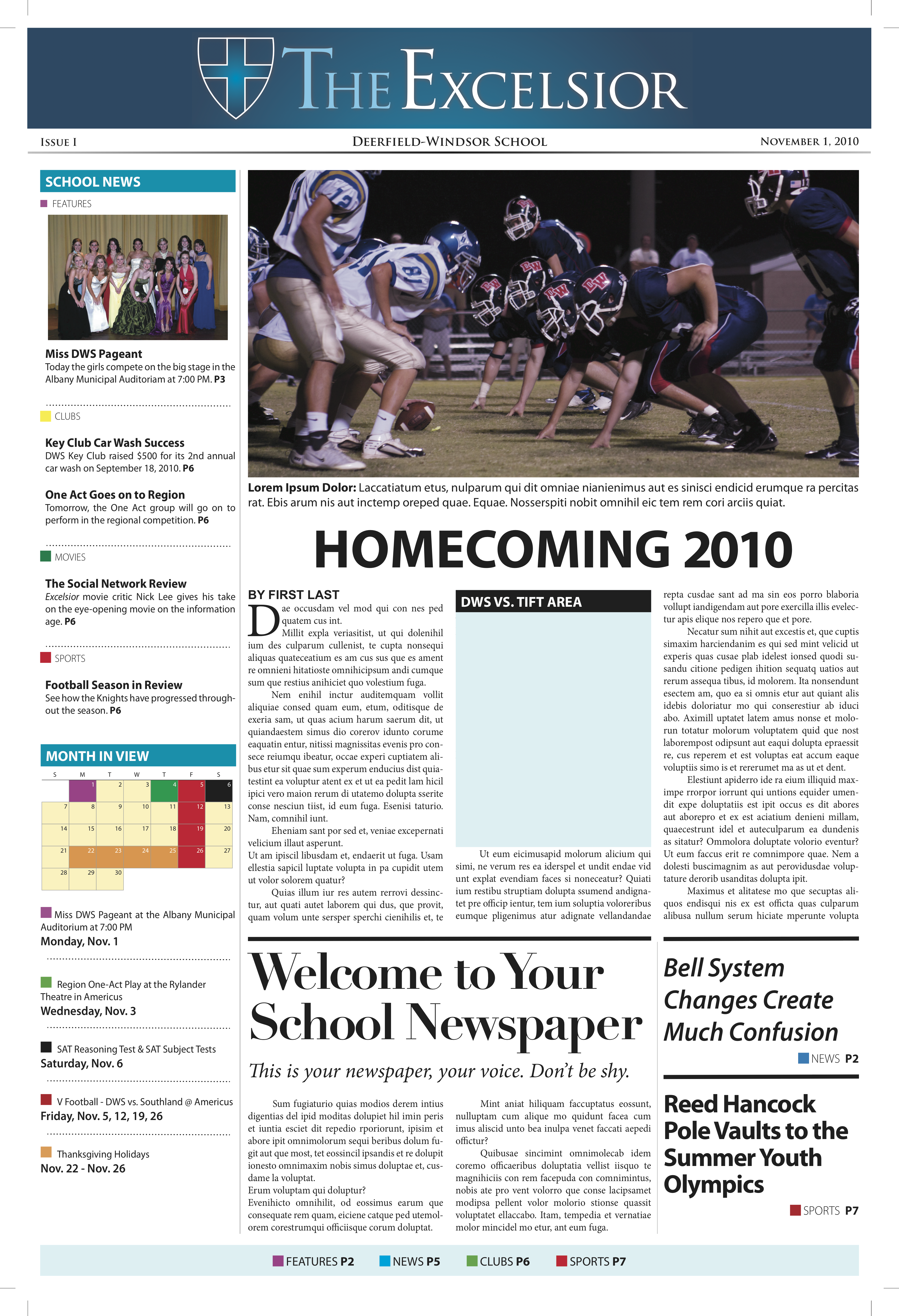
Early Draft
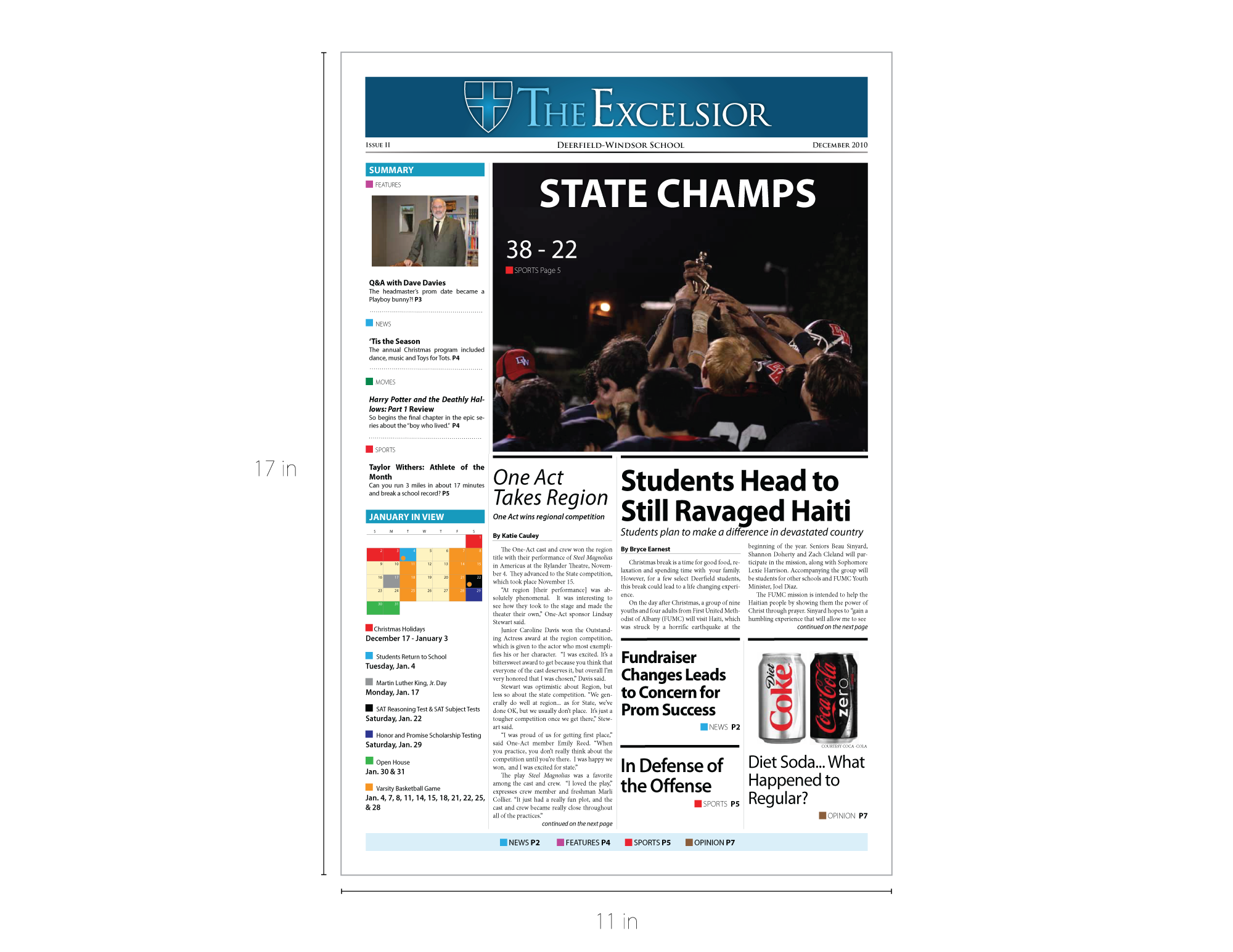
Final Draft
The experience of creating a newspaper was incredibly thrilling and rewarding. Above on the left is a very, very early prototype of the design about six months before the first issue was sent to the press. The final design actually went to its final form fairly quickly after just a few iterations, but I spent hours and hours to improve from the first sketch to the near final version the right. The best part of all this was seeing people actually read and enjoy the articles that fellow students wrote and edited. They were an amazing team to work with, and I'd do it all over again.